Python for Quantum Mechanics:#
Line Plots#
from IPython.display import YouTubeVideo
YouTubeVideo('D50f3tPYUiM',width=700, height=400)
matplotlib.pyplot is a collection of functions like those in MATLAB for plotting in Python. Used in conjuction with numpy, useful visualisations of data can easily be created. We will import both libraries in the next cell.
import matplotlib.pyplot as plt
import numpy as np
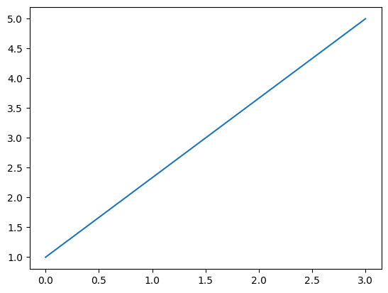
Lets create two NumPy arrays each containing the \(x\)- and \(y\)-coordinates respectively of a two points, \((0,1)\) and \((3,5)\). The plt.plot() function in Matplotlib can be used to plot the line between these two points.
x_points = np.array([0,3])
y_points = np.array([1,5])

plt.plot(x_points, y_points)
plt.show()
The plt.show() isn’t stricktly necessary for jupyter notebooks but is a good habit to be in going forward.
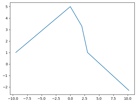
We can also plot longer arrays or coordinates and we get a line connecting each point succesively.
x_points = np.array([-9.5,0,2.0,3,10.2])
y_points = np.array([1,5,3.3,1,-2.3])

plt.plot(x_points, y_points)
plt.show()
Now we can define a function that returns a polinomial and plot that using np.arange() to sample the \(x\)-axis and plug this sample into a function to get a graph of that function.
def f(x):
    '''Docstring: This returns 5x^3+6x^2-6x-2'''
    return 5*x**3 + 6*x**2 - 6*x -2

x_points_rough = np.arange(-2,1.5,.5)
y_points_rough = f(x_points_rough) # all of the operations are in f(x) are overloaded for NumPy arrays

plt.plot(x_points_rough, y_points_rough)
plt.show()
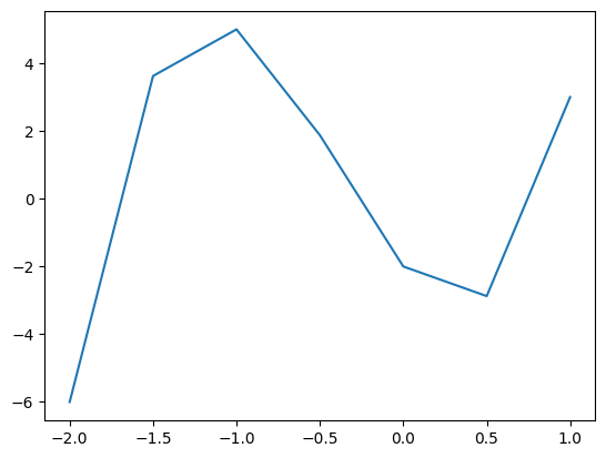
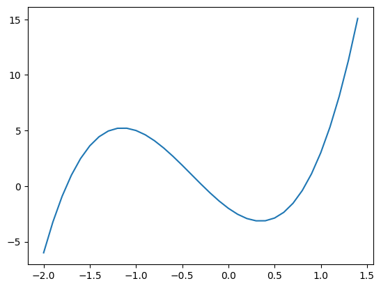
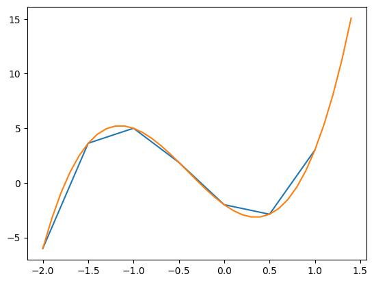
Here we have sampled the \(x\)-axis between \(-2\) and \(1.5\) (exluding \(1.5\)) in steps of \(0.5\). This approximates the shape of a cubic, however if we sample more frequently (for example stelps of \(0.1\) as seen below), we can achive something approximating a smooth curve.
x_points_fine = np.arange(-2,1.5,.1)
y_points_fine = f(x_points_fine)

plt.plot(x_points_fine, y_points_fine)
plt.show()
We can plot both lines on the same graph by calling plt.plot() twice and have two plots on the graph which will automatically be set to differnt colours.
plt.plot(x_points_rough, y_points_rough)
plt.plot(x_points_fine, y_points_fine)
plt.show()
Or we can graph multiple plots in the same plt.plot() call:
plt.plot(x_points_rough, y_points_rough, x_points_fine, y_points_fine)
plt.show()
or prehaps more elegantly
plt.plot(
    x_points_rough, y_points_rough,
    x_points_fine, y_points_fine)
plt.show()
Lines#
In the following section we will look at ways of formatting lines in our plots. We will use the following during the demonstartion.
x = np.arange(0,1,.05)

ex = np.exp(x)
e2x = np.exp(2*x)
e3x = np.exp(3*x)
Colour#
To specify the colour of a line we can use the color or c, keyword when calling plt.plot(). We can use the following named colours (sourced here) or specify a Hex Color Code.


x = np.arange(0,1,.05)
ex = np.exp(x)
e2x = np.exp(2*x)
e3x = np.exp(3*x)
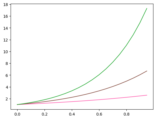
plt.plot(x, ex, c = 'hotpink')
plt.plot(x, e2x, color = 'tab:brown')
plt.plot(x, e3x, '#31AF3F')
plt.show()
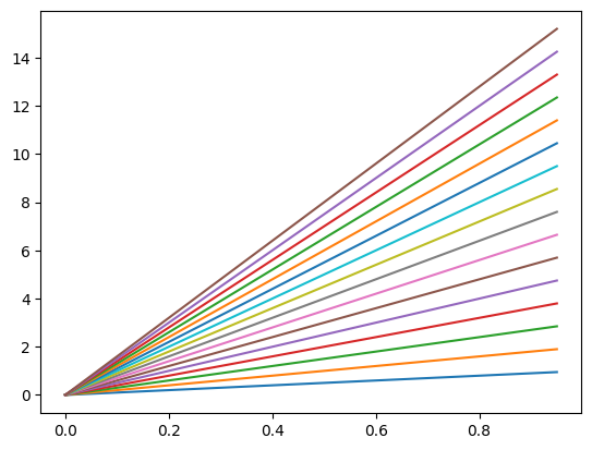
If no colour is specified the ‘Tableau Palette’ will be cycled through as seen below
plt.plot(
    x, x,
    x, 2*x,
    x, 3*x,
    x, 4*x,
    x, 5*x,
    x, 6*x,
    x, 7*x,
    x, 8*x,
    x, 9*x,
    x, 10*x,
    x, 11*x,
    x, 12*x,
    x, 13*x,
    x, 14*x,
    x, 15*x,
    x, 16*x)
plt.show()
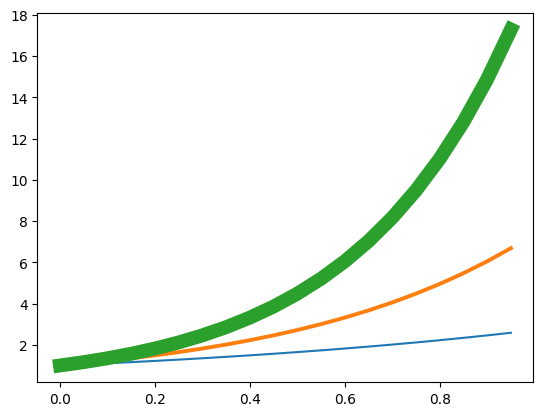
Width#
The line width can be specified with the keyword linewidth or lw and has default value of 1.
plt.plot(x, ex, lw = '1.5')
plt.plot(x, e2x, linewidth = '2.8')
plt.plot(x, e3x, lw = '10')
plt.show()
Line style#
The line’s style can be specified with the keyword linestyle or ls and is defaulted to 'solid'. The other options are
Line |
Name |
Shortcut |
|---|---|---|
|
|
|
|
|
|
|
|
|
|
|
|
|
|


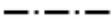
plt.plot(x, ex, linestyle = ':')
plt.plot(x, e2x, ls = 'dashed')
plt.plot(x, e3x, '-.')
plt.show()
The 'None' line style might seem pointless but it can be used when only the point markers are needed which we will seen next. A more complete description of the line style formatting options can be found here.
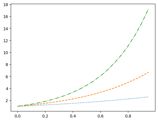
Marker Types#
A marker type can be specified in a similar way to line styles with the keyword 'marker'. A list of the marker types can be found here. When the marker type specified without a keyword the the line style defaults to 'None' showing only the data points without the connecting lines.
x = np.arange(0,1,.05)

plt.plot(x, ex, '.') # dots
plt.plot(x, e2x, marker = '*') # stars
plt.plot(x, e3x, marker = '$hi$', ls = 'None')
plt.show()
I should note that the keyword markerfacecolor and markersize exist and they do as you might expect. I will further note that we can assign colour and marker in a single compact form as seen below. This is useful for quick assignment but might get confusing and/or limit customisability.
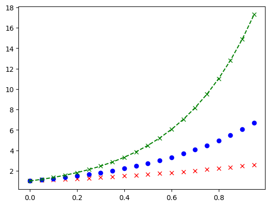
plt.plot(x, ex, 'rx', x, e2x, 'bo', x, e3x, 'g--x')
plt.show()
Axes#
Limits#
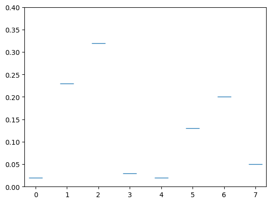
We have seen above that the size of our graph changes and rescales. You can set the \(x\)- and \(y\)-axis limit with plt.xlim() and plt.ylim() as shown.
qbits = [0,1,2,3,4,5,6,7]
probs = [.02,.23,.32,.03,.02,.13,.2,.05]

plt.plot(qbits,probs,'_',markersize = 20)
plt.ylim([0,.4])
plt.show()
Ticks#
We can reformat the \(x\) and \(y\) ticks in the following way.
x_ticks = [0,1,2,3,4,5,6,7]
y_ticks = np.arange(0,1,.02)
x_labels = ['000','001','010','011','100','101','110','111']

plt.plot(qbits, probs, '_', markersize = 20)
plt.xticks(ticks=x_ticks, labels=x_labels)
plt.yticks(ticks=y_ticks)
plt.ylim([0,.4])
plt.show()
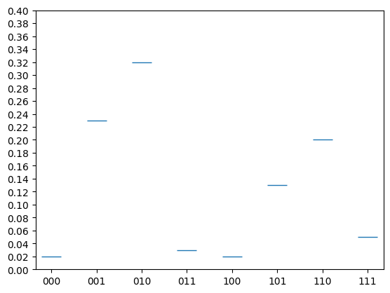
This effect is however better achieved by a histagram or bar chart that we will look at later.
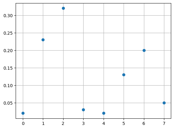
Grid#
Often the clarity of demonstrating the values of the points can be assisted by adding a grid of horizontal and verticle lines stretching from the ticks. This can be toggled on/off using plt.grid().
plt.plot(qbits,probs,'o')
plt.grid()
plt.show()
Lables#
Lables are a great way to explain what it is your are plotting. In the strings used to label a lot of \(\LaTeX\) is supported which can be very useful.
Title#
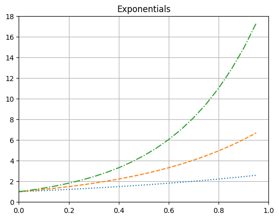
A title string can be added using plt.title().
plt.plot(x, ex, ':')
plt.plot(x, e2x, '--')
plt.plot(x, e3x, '-.')

plt.title('Exponentials')

plt.xlim([0,1])
plt.ylim([0,18])

plt.grid()

plt.show()
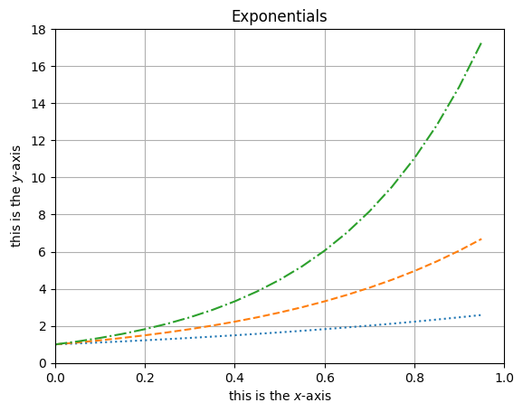
Axis Lables#
Similarly, plt.xlabel() and plt.ylabel() can be used to add labels to the \(x\)- and \(y\)-axes respectively.
plt.plot(x, ex, ':')
plt.plot(x, e2x, '--')
plt.plot(x, e3x, '-.')

plt.title('Exponentials')
plt.xlabel('this is the $x$-axis')
plt.ylabel('this is the $y$-axis')

plt.xlim([0,1])
plt.ylim([0,18])

plt.grid()

plt.show()
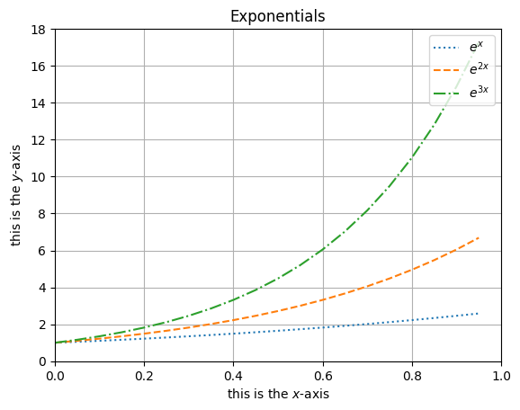
Legend#
In plt.plot() we can assign a name to what is being plotted using the label keyword. A legend displaying this can then be toggled on/off using plt.legend() with keyword loc to set a location.
plt.plot(x, ex, ':', label = '$e^x$')
plt.plot(x, e2x, '--', label = '$e^{2x}$')
plt.plot(x, e3x, '-.', label = '$e^{3x}$')

plt.title('Exponentials')
plt.xlabel('this is the $x$-axis')
plt.ylabel('this is the $y$-axis')

plt.xlim([0,1])
plt.ylim([0,18])

plt.grid()
plt.legend(loc = 'upper right')

plt.show()
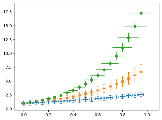
Error Bars#
If we call plt.errorbar() instead of plt.plot() we can add error bars in the \(x\) and \(y\) directions by specifying either a constant error or a list as the xerr and yerr. These error bars can be formatted in various ways as shown with capsize and here.
plt.errorbar(x, ex, ls = 'None',  marker = '.', xerr=.02, yerr=.4, capsize = 3)
plt.errorbar(x, e2x, ls = 'None', marker = 'x', xerr=.01, yerr=.2*e2x, capsize = 2)
plt.errorbar(x, e3x, ls = 'None', marker = 'o', xerr=x/10, yerr=x, capsize = 0)
plt.show()
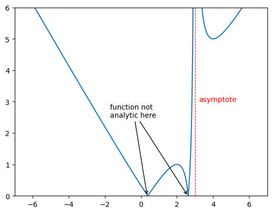
Asymptotes and Annotations#
Verticle and horizontal lines can be added using plt.vlines() and plt.hlines which takes in the value the line is at and the begining and end of the line as arugaments as shown. One can also have an array of vales for this which will give many lines.
The function annotate plt.annotate() is ver useful when you want to draw attention to a particular point in your plot. It takes in a string that will be displayed and the point you are interested in. One can change the text colour as you might expect by calling the c keyword. The text can be put at different point to the point of intrest using xytext and an arrow can be generated between using arrowprops and giving a dictionary that will specify the features as shown.
xs = np.arange(-7,7,.01)
ys = np.abs(xs - 1/(3-xs))

plt.xlim([-7,7])
plt.ylim([0,6])


plt.plot(xs,ys)

plt.vlines(3,0,10,color='r',ls='dashed',lw=.8)


plt.annotate('asymptote',(3.2,3),c='r')
plt.annotate('function not\nanalytic here',(2.6,0),c='w',xytext=(-1.7,2.5),arrowprops={'arrowstyle':'->', 'lw':1})
plt.annotate('function not\nanalytic here',(.35,0),xytext=(-1.7,2.5),arrowprops=dict(arrowstyle='->',lw=1))

plt.show()
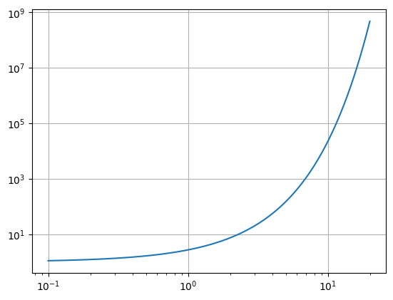
Log Plot#
Very often data is better displayed using logarithmic scaling on the axes.
Log-log plot#
One can make a log-log plot using plt.loglog() in the place of plt.plot().
x = np.arange(0.1,20,.01)
y = np.exp(x)

plt.loglog(x,y)
plt.grid()
plt.show()
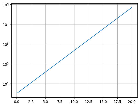
Semi-log plot#
We can also scale just one axis with a log scaling.
x = np.arange(0.1,20,.01)
y = np.exp(x)

plt.semilogy(x,y)
plt.grid()
plt.show()
x = np.arange(0.1,20,.01)
y = np.log(x)

plt.semilogx(x,y)
plt.grid()
plt.show()
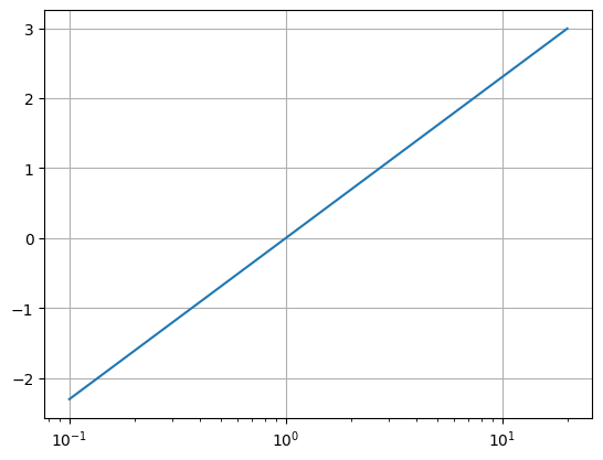
Figure Object#
So far we have been plotting rather recklessly without looking into what objects we have been creating in our plots. This is fine when we only want to get a quick look at our data but for puplication or the like we will require more costomisability and to put this on more solid footing.
One creates a figure object using the plt.figure() function. We can specify the figure dimensions in inches as a tupple using the figsize keyword. We then can add a a set of axes to this figure using the .add_axes() attribute funtion of the figure. This function takes in the argument of a list that specifies things about our axes. The list elements are taken as the [left, bottom, width, height] as fractions of the size height an width.
fig = plt.figure(figsize=(9,4))
ax = fig.add_axes([0.1,0.1,.8,.8])
We can then plot on this set of axes, now using the attribute of the axis we can plot in a similar way.
fig = plt.figure(figsize=(9,4))
ax = fig.add_axes([0,0,1,1])

x = np.arange(0,10.2,.2)
ax.plot(x, np.sin(x), c='green', lw=.5, ls='--', marker='*', label='$\sin(x)$')
ax.plot(x, np.cos(x), c='blue', lw=2, ls='-.', label='$\cos(x)$')

ax.set_xlim(0,10)
ax.set_ylim(-1.03,1.03)
ax.set_title('Trig Functions')

ax.legend()
ax.grid()
<>:5: SyntaxWarning: invalid escape sequence '\s'
<>:6: SyntaxWarning: invalid escape sequence '\c'
<>:5: SyntaxWarning: invalid escape sequence '\s'
<>:6: SyntaxWarning: invalid escape sequence '\c'
/tmp/ipykernel_2565/2392594966.py:5: SyntaxWarning: invalid escape sequence '\s'
  ax.plot(x, np.sin(x), c='green', lw=.5, ls='--', marker='*', label='$\sin(x)$')
/tmp/ipykernel_2565/2392594966.py:6: SyntaxWarning: invalid escape sequence '\c'
  ax.plot(x, np.cos(x), c='blue', lw=2, ls='-.', label='$\cos(x)$')
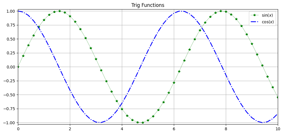
Many of the functions act the same as before but now they are attributes of the axis object and have set_ before them.
We can also not save this image.
fig.savefig('first_image.png')